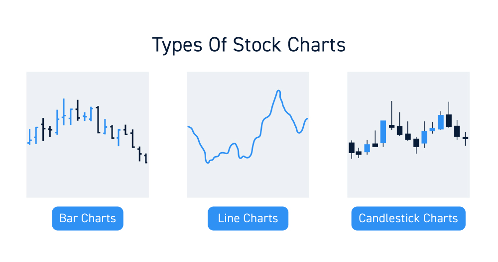
Did you know that many day traders can’t tell a candlestick from a sugar cookie? Understanding the nuances of line, bar, and candlestick charts is crucial for successful trading. Each chart type offers unique insights and advantages, catering to different trading strategies and experience levels. In this article, we’ll explore what line charts are and how they’re used, how bar charts provide deeper information, and why candlestick charts are a favorite among traders. We’ll also cover key features, readability comparisons, common mistakes, and tips for selecting the right chart type for your strategy. By the end, you’ll be better equipped to enhance your trading approach with the right tools and insights, courtesy of DayTradingBusiness.
What are line charts and how are they used in day trading?
Line charts are visual representations of price movements over time, displaying a single line connecting closing prices for each time period. In day trading, they help traders quickly identify trends and overall price direction. While they are simpler than bar or candlestick charts, line charts are useful for spotting support and resistance levels and can make it easier to recognize patterns. Traders often use them for a quick overview of price action before diving deeper into more complex chart types.
How do bar charts differ from line charts in day trading?
Bar charts display price movements over time using vertical bars for each period, showing open, high, low, and close prices. Line charts, on the other hand, connect closing prices over time with a continuous line, emphasizing price trends rather than individual price data. In day trading, bar charts provide detailed information about price action and volatility, allowing traders to analyze fluctuations more effectively. Line charts simplify the data, making it easier to identify overall trends but lacking the depth of bar charts.
What is a candlestick chart and why is it popular among day traders?
A candlestick chart is a financial chart that displays the price movement of an asset over a specific time frame, using individual "candlesticks" to represent opening, closing, high, and low prices. Each candlestick shows whether the price increased or decreased during that period.
It's popular among day traders because it provides more information than line or bar charts, allowing traders to quickly assess market momentum, identify trends, and spot potential reversals. The visual format makes it easier to interpret price action and market sentiment at a glance, which is crucial for making quick trading decisions.
What are the key advantages of using line charts in trading?
Line charts in trading offer several key advantages:
1. Simplicity: They provide a clear and straightforward view of price movements over time, making it easy to identify trends.
2. Trend Visualization: Line charts effectively highlight overall trends without the clutter of multiple data points, helping traders make quick decisions.
3. Data Clarity: They focus solely on closing prices, reducing noise and allowing traders to see the essential price action.
4. Timeframe Flexibility: Line charts can be easily adjusted to different timeframes, aiding in both short-term and long-term analysis.
5. Comparison Ease: When comparing multiple assets, line charts simplify the process, making it easier to spot relative performance.
These advantages make line charts a valuable tool for traders seeking clarity and efficiency in their analysis.
How do bar charts provide more information than line charts?
Bar charts provide more information than line charts by displaying individual data points for each category, allowing for direct comparison of values. They show the magnitude of each bar clearly, making it easier to identify differences in data at a glance. In day trading, bar charts can highlight volume and price changes within specific time frames, while line charts primarily focus on the overall trend without emphasizing these details. This makes bar charts more effective for analyzing discrete events or categories in trading.
What insights can candlestick patterns offer to day traders?
Candlestick patterns provide day traders with critical insights into market sentiment and potential price movements. Unlike line or bar charts, candlesticks reveal open, high, low, and close prices in a single visual, allowing traders to identify trends and reversals quickly.
For example, patterns like dojis indicate indecision, while engulfing patterns suggest strong reversals. Traders can spot bullish or bearish trends by analyzing formations and their contexts. This helps in making more informed entry and exit decisions, optimizing profit potential.
When should I use line charts over bar or candlestick charts?
Use line charts when you want to visualize trends over time clearly and simply, especially for continuous data. They work best for showing price movements or changes in a single variable. Opt for bar charts when you need to compare discrete categories or show volume alongside price. Candlestick charts are ideal for day trading, as they provide detailed information on price action, including open, close, high, and low within a specific time frame. Choose based on the type of analysis you're conducting: trends (line), comparisons (bar), or detailed price movements (candlestick).
How can I interpret price movements using bar charts?
To interpret price movements using bar charts, focus on the following:
1. Price Range: Each bar shows the open, high, low, and close prices for a specific time period. The vertical line represents the price range, while the horizontal line indicates the opening and closing prices.
2. Bar Color: A bar that closes higher than it opens is typically colored green (or white), indicating bullish movement, while a bar that closes lower than it opens is usually red (or black), indicating bearish movement.
3. Volume Analysis: Pay attention to the volume associated with each bar. Higher volume during a price movement signifies stronger momentum.
4. Trend Identification: Look for patterns in the bars—consecutive bullish bars suggest an uptrend, while consecutive bearish bars indicate a downtrend.
5. Support and Resistance: Identify where bars consistently bounce off or are rejected, indicating potential support or resistance levels.
Use these elements to gauge market sentiment and make informed trading decisions.
What are the main features of candlestick charts?
Candlestick charts display the open, high, low, and close prices of an asset for a specific time period. Each candlestick consists of a body and wicks, indicating price movement. The body represents the opening and closing prices, while the wicks show the highest and lowest prices during that period.
Key features include:
1. Color Coding: Typically, green (or white) indicates a price increase, and red (or black) indicates a price decrease.
2. Patterns: Various formations, like dojis or hammers, signal potential market reversals or continuations.
3. Timeframes: Candlestick charts can be customized for different timeframes, from minutes to days.
4. Volume: Often integrated with volume data to enhance trading signals.
These features help traders analyze market trends and make informed decisions.
How do line, bar, and candlestick charts compare in terms of readability?

Line charts are the simplest, showing only closing prices over time, making them easy to read but lacking detail. Bar charts provide more information, displaying open, high, low, and close prices, which helps traders understand price movements better but can be cluttered. Candlestick charts offer the most visual detail, illustrating the same data as bar charts but with color coding for bullish or bearish trends, enhancing quick interpretation. Overall, candlestick charts are often favored for their readability and ability to convey market sentiment at a glance.
Which chart type is best for beginners in day trading?
Candlestick charts are best for beginners in day trading. They provide clear visual cues about price action, including open, high, low, and close, helping traders quickly identify trends and patterns. Line charts are too simplistic, while bar charts can be confusing. Candlestick charts balance detail and clarity, making them ideal for grasping market movements.
What common mistakes should traders avoid with these chart types?
Traders should avoid these common mistakes with line, bar, and candlestick charts:
1. Ignoring Time Frames: Using the wrong time frame can mislead decisions. Stick to the appropriate time frame for your trading strategy.
2. Overcomplicating Analysis: Relying on too many indicators can create confusion. Focus on a few key signals that complement the chart type.
3. Neglecting Volume: Failing to consider volume alongside price movements can lead to false signals. Always check volume for confirmation.
4. Misinterpreting Patterns: Not understanding specific chart patterns can result in poor trades. Learn the key patterns specific to each chart type.
5. Emotional Trading: Making impulsive decisions based on short-term chart movements can derail your strategy. Stay disciplined and stick to your plan.
6. Disregarding Market Context: Ignoring broader market trends can lead to mistakes. Always consider the overall market environment before trading.
Avoid these pitfalls to improve your trading effectiveness with line, bar, and candlestick charts.
How can I choose the right chart type for my trading strategy?
To choose the right chart type for your day trading strategy, consider the following:
1. Line Charts: Best for a clear view of price trends over time. Use this if you want a simple representation of price movements without too much detail.
2. Bar Charts: Ideal for analyzing price range within a specific time frame. They show open, high, low, and close prices, making them useful for spotting volatility and potential reversals.
3. Candlestick Charts: Most popular among day traders. They provide detailed information about price action, including market sentiment. Use candlesticks for their visual appeal and ability to highlight patterns, such as dojis or engulfing patterns, which can signal trading opportunities.
Choose based on your strategy: if you need simplicity, go with line charts; for detailed price action, opt for bar or candlestick charts.
Learn about How to Choose the Right Backtesting Software for Day Trading
What tools are available for creating line, bar, and candlestick charts?
For creating line, bar, and candlestick charts in day trading, consider these tools:
1. TradingView: Offers customizable charting options with a user-friendly interface and a wide range of indicators.
2. MetaTrader 4/5: Popular among Forex traders for its robust charting capabilities and technical analysis tools.
3. ThinkorSwim: A powerful platform by TD Ameritrade, ideal for advanced charting and analysis.
4. ChartIQ: A professional-grade charting solution with features tailored for financial analysis.
5. Excel: For those who prefer manual creation, Excel can generate basic line and bar charts.
Choose based on your trading style and the features you need.
How do time frames affect the interpretation of these charts?
Time frames significantly impact how line, bar, and candlestick charts are interpreted in day trading. Shorter time frames, like 1-minute or 5-minute charts, reveal quick price movements and can show immediate trends, making them ideal for scalping. In contrast, longer time frames, such as hourly or daily charts, provide a broader view, highlighting overall trends and reducing noise, which helps in identifying major support and resistance levels.
Candlestick charts, with their detailed open, high, low, and close data, become more meaningful in shorter time frames, allowing traders to spot reversals and continuation patterns quickly. Bar charts also benefit from shorter intervals, while line charts may oversimplify data in rapid markets. Choosing the right time frame is crucial; it shapes trading strategies and influences decision-making based on the trader's objectives and risk tolerance.
Can combining different chart types enhance day trading strategies?
Yes, combining different chart types can enhance day trading strategies. Line charts provide a clear view of price trends over time, while bar charts offer more detail on open, high, low, and close prices. Candlestick charts, with their visual patterns, can reveal market sentiment and potential reversals. By integrating these charts, traders can gain a comprehensive view of price action, identify trends, and make informed decisions. For example, using candlestick patterns alongside line charts can help confirm entry and exit points, improving trade accuracy.
Learn about Techniques for Combining Different Analysis Methods in Day Trading
Conclusion about Comparing Line, Bar, and Candlestick Charts in Day Trading
In summary, choosing the right chart type—line, bar, or candlestick—plays a crucial role in effective day trading. Each chart offers unique advantages, with line charts providing simplicity, bar charts delivering detailed information, and candlestick charts offering visual insights into price movements and patterns. Understanding when to use each type can enhance your trading strategy significantly. For more comprehensive guidance on these charting techniques and their applications, explore the resources available at DayTradingBusiness.